Art Making Activity: A Woman of Importance
I am not going to tell you that finding inspiration to create is easy. It is not. It can be a real challenge. It seems time is rarely on our side. Then you must grapple with the notion of what is possible within that context as well as within your own comfort level.
But don’t let your inhibitions or self-doubt hold you back. While it is true some art demonstrates more skill or understanding than others, the fact of the matter is that you can find great truth and power in the act of making your own artistic creations. No matter the end result. It is the journey and not always the destination.
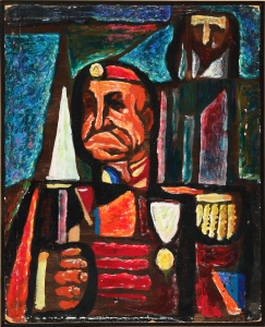
This week, I found inspiration in works by Samuel Rosenberg in the Museum’s permanent collection. I was drawn to the stained-glass style of several of his paintings, Generalissimo (Man of Importance) being one of them.
I did some research and found he was an artist and teacher in Pittsburgh, and even found a book about him written by Chief Curator, Barbara L. Jones. Here is a link to that book and an excerpt from the description that references what I was drawn to in these paintings.
“In the 1940s, responding to the horrors of World War II, Rosenberg’s subjects became more universal and allegorical. In paintings such as Israel (1945), his most reproduced work, haunting human figures do not allow viewers to remain indifferent to the world situation. Here he began experiments with abstraction and the quality of light, a search he would continue for the rest of his life. From 1949 until his death in 1972, Rosenberg developed his own form of abstract expressionism, translating emotion with color, but without entirely abandoning representation. Using sequential layers of translucent color and transparent glazes, Rosenberg was able to achieve a penetrating, shimmering effect in his work. His paintings from this period are reminiscent of stained glass windows in that they seem to emit light rather than reflect it.”
In relation to what I just discovered about Samuel Rosenberg and his style during this period of Generalissimo, I too wanted to create an image that made some kind of social commentary.
Supplies you will need today include:
- Pencil
- Drawing paper
- Collage paper (printed, photos, scrapbook paper, etc.)
- Elmers glue
- Illustration board or something rigid to use as substrate (cardboard, Masonite, etc.)
- Acrylic paint
- Sharpie marker
Optional supplies:
- Wax melter
- Paraffin wax
- Crayons
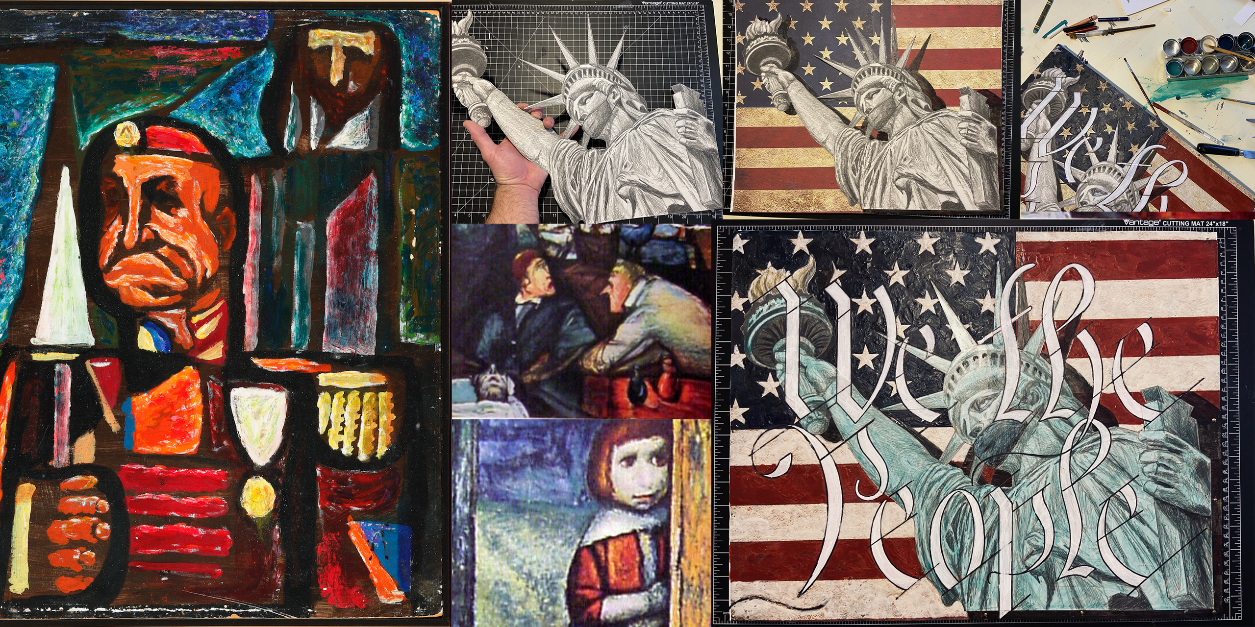
Step 1: Create the Image
I wanted to do something with liberty – a topic on the minds of many during this time.

While it would have been possible to come up with another important symbol of liberty – other than the one that stands in the New York harbor, I decided it would make a clear statement. I made a pencil sketch on paper from my reference photo. Without a clear path of where I wanted this to end up, I worked the sketch a little more, adding my own details.


Step 2: Create the Background
At the same time as I was drawing this (May 15th), Jasper Johns celebrated his 90th birthday. Happy Birthday, Mr. Johns! And, of course, I was reminded of his encaustic paintings that also appear to emit, rather than reflect, light.
So, I decided to create a separate background. You may choose to do this in a number of ways, but I wanted to use an American flag, in homage to Mr. Johns of course.
I used the internet to find an America flag and simply printed it over four pages, since I wanted the size to be 16”x20”. You can do this via any word document by using four rectangular screenshots of the four quadrants of the image, and print them separately. Then I glued my printed pages together on a 16”x20” board to create the background.
There are also other programs, such as Illustrator and Photoshop, that allow greater control in printing tiled images via a printer that only accommodates smaller paper sizes. If you are trying to use a printed image, you may need to do your own research on doing this step. I know there are many solutions, but it will all depend on the technology available to you.
Other suggestions for this step would be to create a collage of scrapbook paper, magazine pages, photos, or any other combination of ways you may decide to explore for your background.
I will note that collage can be tricky in the gluing process. I recommend Elmer’s glue, used in thin layers, applied with a brush and then nice pressure from the back to get a good adhesion. I also lay multiple books across the surface during the drying process to maintain a smooth surface and prevent warping.
Step 3: Joining Your Subject to the Background
I used an x-acto knife and carefully cut out my drawing.

I wanted to create some depth to the background image and decided to create a simple drop shadow.
To do this, I used several small wooden blocks to hold the image of Liberty above the background and under a direct light source, traced around the shadows. If you zoom in on the image below, you can see my pencil lines!
(If don’t have wooden blocks handy, get creative with what is available to you. Anything of similar height will work, like clothes pins, marker caps, some kind of lid or container, etc.)


To paint in this shadow, I mixed black acrylic paint with a little water. Be sure to check for the right consistency and gradation! Paint in the areas that will be seen once the drawing is placed directly on the background image.

Once the paint was dry, I glued the drawing in place.

Step 4: Finishing Details
I suppose I could have called it quits right there, but I wanted to add something else to the composition. I also wanted to add more to the background as it was only a collaged print.

I used a piece of paper to create a template of the letters I would need to write ‘We the People’ on the surface of the image.
Note: If you have any letters that appear more than once, you only need to create one template. Also, some letters may be able to function as parts of other letters. For example, “l” can work as part of “t”.

After tracing these letters, I used a watered down white paint to white wash the letters and a black Sharpie for some edging and diagonal lines.
To complete the background, in another nod to Jasper Johns, I decided to experiment with melting wax. I used red, white, and blue crayon mixed with paraffin wax to layer on additional color and texture to the background.

The final touch was adding crayon on the original pencil drawing.

Now I realize that this may be out of that comfort zone for some of you. However, the message this week is less about the actual project and more about that journey of discovery. Remember, I did not start out with anything specific in my mind about where I wanted this to end up. I only started by making a pencil sketch based on the notion I discovered in the work of Samuel Rosenberg. But with some incubation time and reflection, I made my way to something that may not be the destination, but it will at least advance my conversation.
On the wall of my art room, a student painted a phrase I often told them in class, “Art is an ongoing dialogue.” (Thank you, Maura.) Don’t be afraid to join in.
Be brave. Be bold. Be amazing!
And entering week 10 of social distancing, the very isolated artist aka Studio Programs Coordinator Michael Carsone.