The Era of Cool Continues!
by Barbara Jones, Chief Curator at The Westmoreland Museum of American Art.
Over the course of nearly sixty years, multidisciplinary graphic artist John Van Hamersveld has created influential and instantly recognizable design.
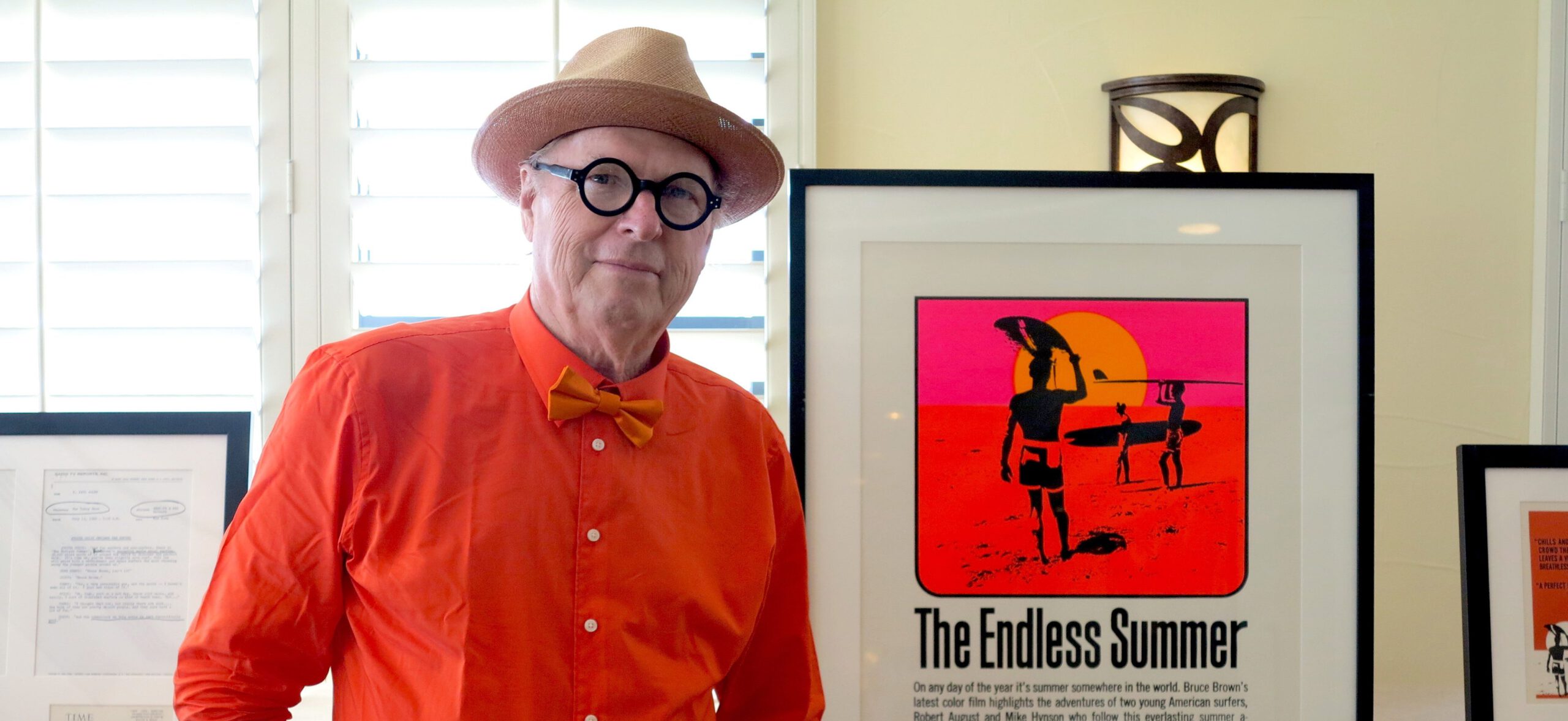
Van Hamersveld’s career was launched with his design in 1964 of The Endless Summer poster to promote Bruce Brown’s iconic surfing film of the same name. That poster, comprised of Day-Glo colors to attract the youthful eye, was inspired by a sunset photo of Dana Point Beach in Orange County, where a teenage Van Hamersveld and his friends would surf. His image of a color saturated sunset and surfers became the icon of California’s surfing scene, and has outlived the movie in recognition.
From Surfer Magazine to Rock n’ Roll
Van Hamersveld’s success with that poster moved
him from surfer and surfing culture to rock n’ roll. Working for both Capitol (1967) and Elektra (1978) Records, he designed over 300 album covers, creating such memorable covers as the Beatles’ Magical Mystery Tour, the Grateful Dead’s Skeletons in the Closet, and the Rolling Stones’ Exile on Main Street, as well as the packaging for An American Prayer, Jim Morrison’s book of poetry.
Van Hamersveld left Capitol Records to go out on his own after designing Magical Mystery Tour. As an artist, he had his finger on the pulse of the times, and his iconic artwork captured the energy of an era. Listening to the Beatles and the Rolling Stones records, the new beat generation, including Bob Dylan, and watching underground cinema, Van Hamersveld thoroughly immersed himself in the culture of the time, replete with tie-dye, psychedelic music, love-ins, and drugs. He grew up during a turbulent era of race riots in Los Angeles, the Vietnam War, burning draft cards and American flags, and the formation of the “Brotherhood of Eternal Love,” led by Timothy Leary, the high priest of psychedelic drugs.
Together with two partners, he founded Pinnacle Productions in 1967. He booked bands and designed posters to promote rock concerts that he called “happenings” by such musical legends as Jimi Hendrix, Bob Dylan, Jefferson Airplane, the Grateful Dead, and Cream, among many others. Van Hamersveld’s stint at Pinnacle was brief, and it later became Pacific Productions, Los Angeles, after his departure.
While Van Hamersveld’s designs are composed of vibrant and often electric colors, each one begins with a simple black and white drawing made with his trusty Pentel or Sharpie pen. He then scans these drawings into the computer and that is where the magic happens. He manipulates the colors until they reach the desired saturation and vibrancy. From the moment Van Hamersveld was introduced to the computer by his friend Steve Jobs, who gave him one in 1983, he became immersed in the digital art world, a practice he continues today. “I’m still drawing on the analog world but I’m using the computer as a very sophisticated copy machine… the drawing has gone into the fourth dimension.”
Drawing was at the heart of his education at L.A.’s Chouinard Art Institute (now California Institute of the Arts/CalArts) and remains at the core of his work. In Chouinard’s alumni listing, Van Hamersveld is described as “graphic designer, album cover and movie poster maven.” He thinks of his drawing like surfing in a way, “lines on paper are like surfers on waves.”
Influences
Van Hamersveld recalls the art scene at the Pasadena Art Museum where he saw the Pop artwork of Andy Warhol among others. Warhol’s first show in L.A. was in 1962, and Van Hamersveld watched Warhol movies. He met Warhol in 1967 and ten years later would design the Bad poster for the artist’s film of the same name. M.C. Escher, with his impossible patterns” was also an inspiration. He said “my head was spinning in how I would make my career in their territories and media.” Inspiration for his drawing also came from Japanese printmakers Katsushika Hokusai and Utagawa Hiroshige as well as the black ink drawings of the English art nouveau artist, Aubrey Beardsley.
He designed the official poster and 360-foot long mural for the 1984 Los Angeles Olympic Games, and he continues to design logos, brand identity, and large-scale murals for both public and private clients. At age 77, he continues to reinvent himself, saying “I’m constantly on fire.”
Two recent public projects he is especially proud of are: the 75-foot mural in Hermosa Beach showing three surfers in a kaleidoscopic rush of bright color and movement to honor the City’s surf history (2015); and the 510-foot diameter mural on a water tank in El Segundo, California, where he graduated from high school. Fifty-one vividly colored panels pay tribute to local surfer legends and the city where he spent his formative years (2018). Van Hamersveld’s current work consists of a series of colorful waves, still drawing inspiration from Hokusai and Hiroshige, as well as his early connection to the waves as a surfer. He refers to his present style as “Indo” style, based on the Bauhaus. “It’s a mutation of them in a way,” he says.
Organized by Chief Curator Barbara Jones and Curatorial Assistant Bonnie West in partnership with Van Hamersveld and his wife Alida Post, Era of Cool serves as a retrospective of Van Hamersveld’s work from the original album cover artwork designed during his days at Capitol Records to his recent large-scale mural works—all together in a stunning display in the Museum’s Cantilever Gallery space.


